Context
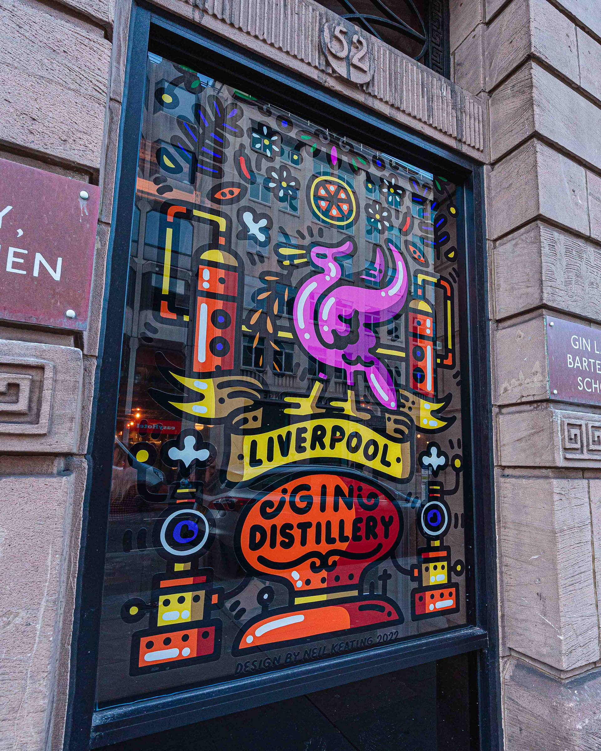
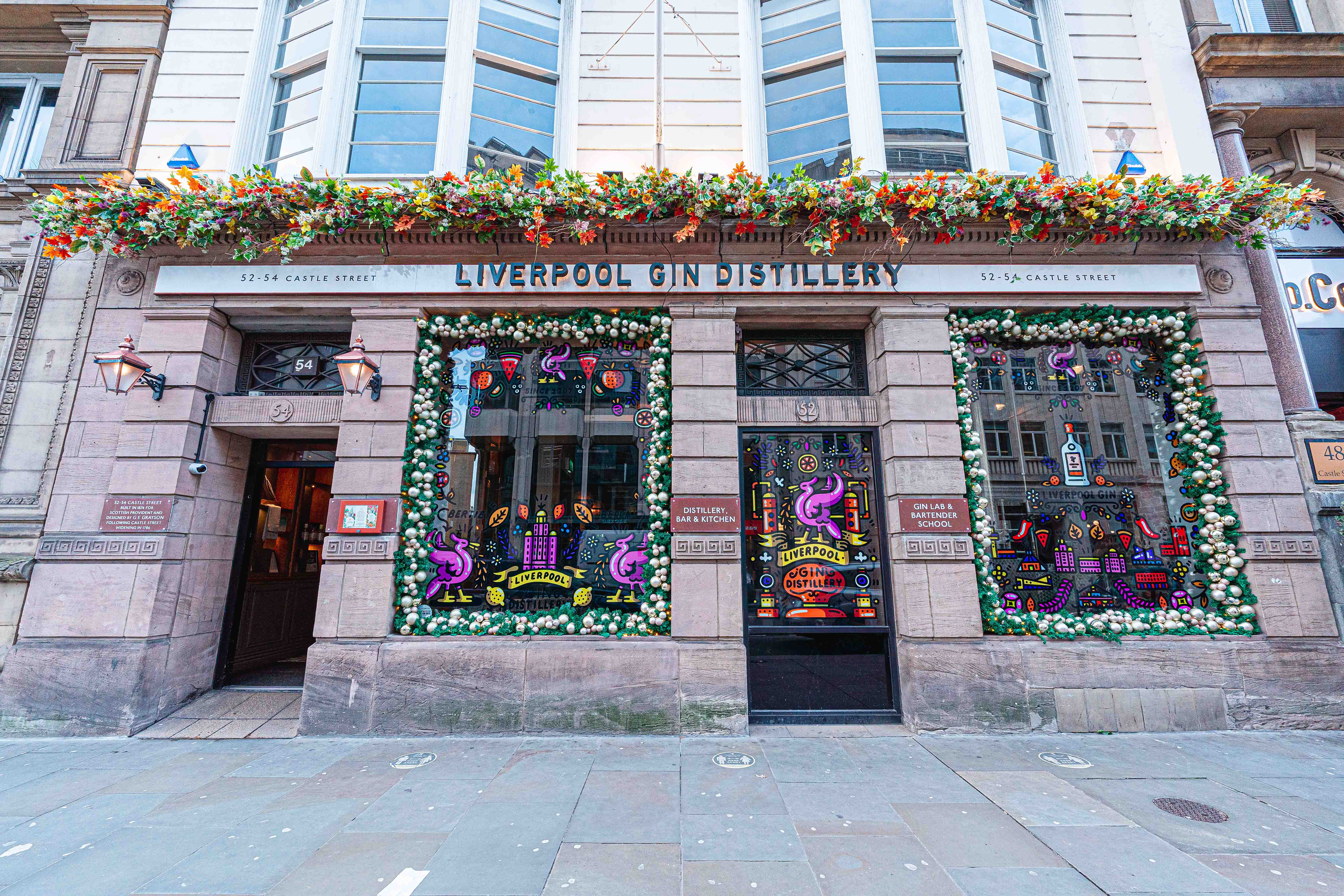
Liverpool Gin initially approached me to design a series of window decals for their distillery aimed at strengthening their visual presence and drawing in visitors.
Following a strong response, the project expanded into a full rebrand of their flavoured gin range creating an opportunity to unify the brand across both physical space and product.
The aim was to develop a visual identity that could celebrate the brand’s local roots while standing out within an increasingly competitive craft spirits market.
Creative Role
Lead Artist & Designer
Concept development for visual identity
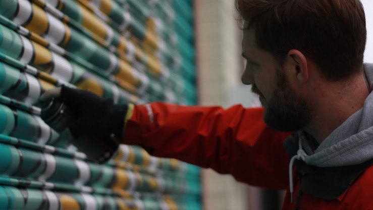
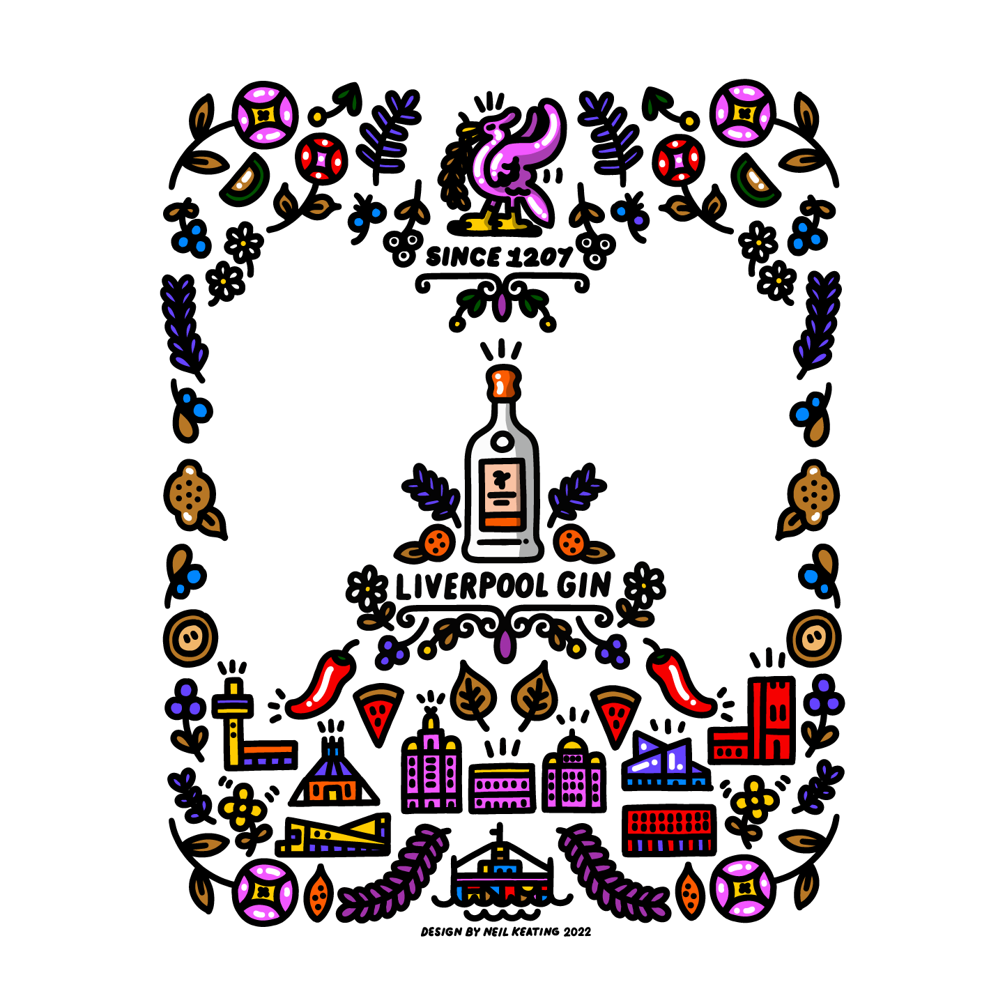
Design of distillery window graphics
Rebrand of flavoured gin labels and packaging
Creation of cohesive artwork system across product range
Execution
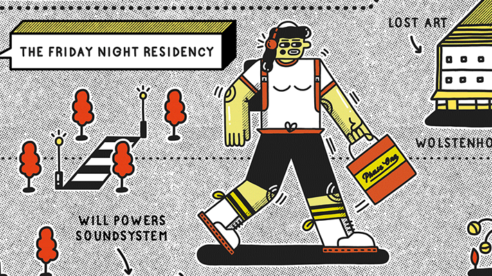
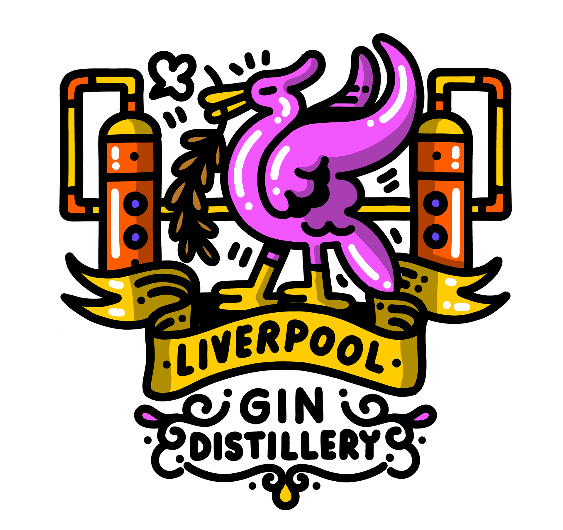
The project began with large-scale window graphics designed to act as a bold visual invitation into the distillery, capturing attention while reflecting the character of the brand.
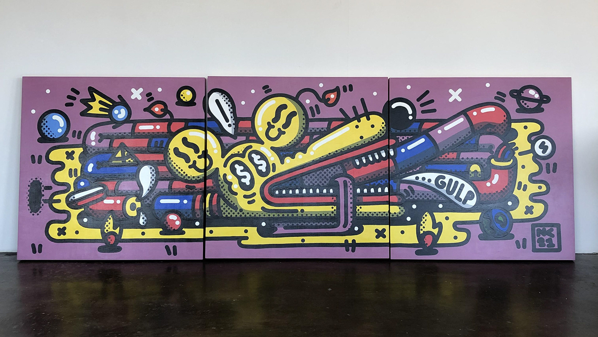
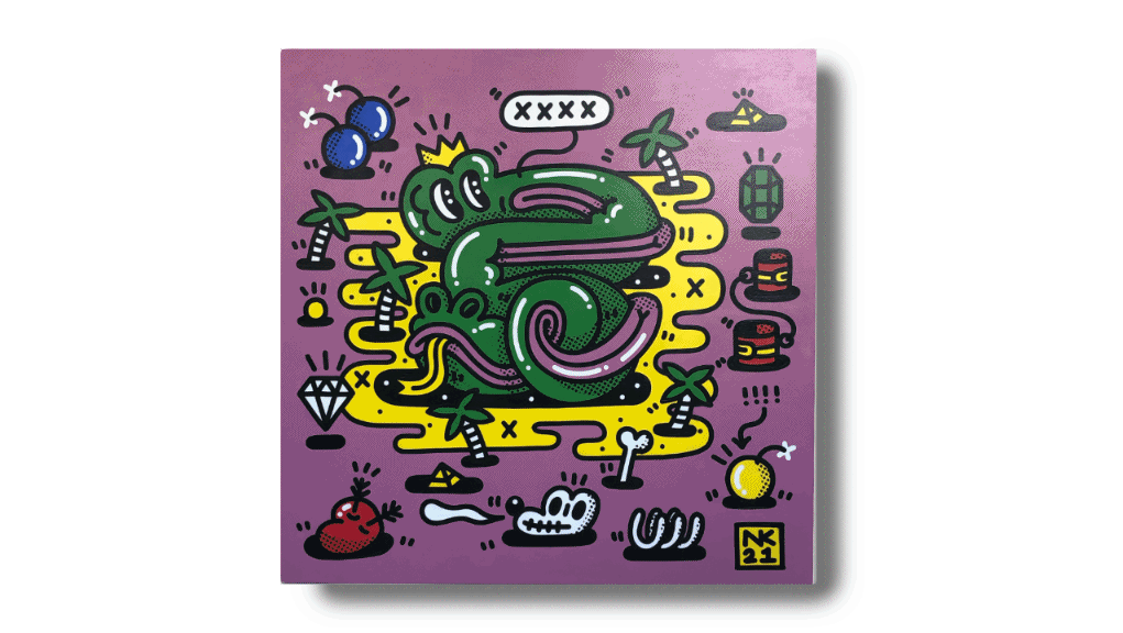
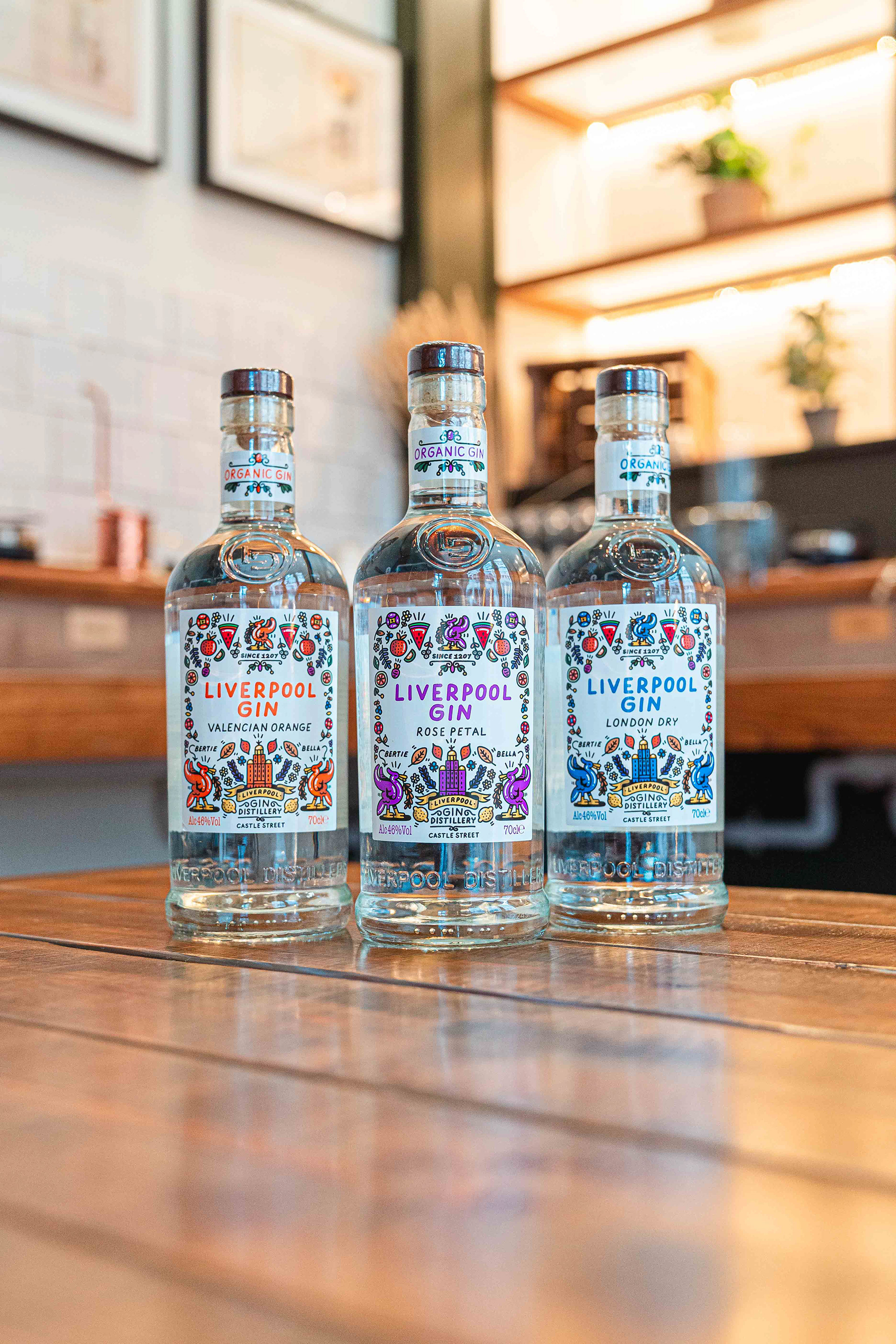
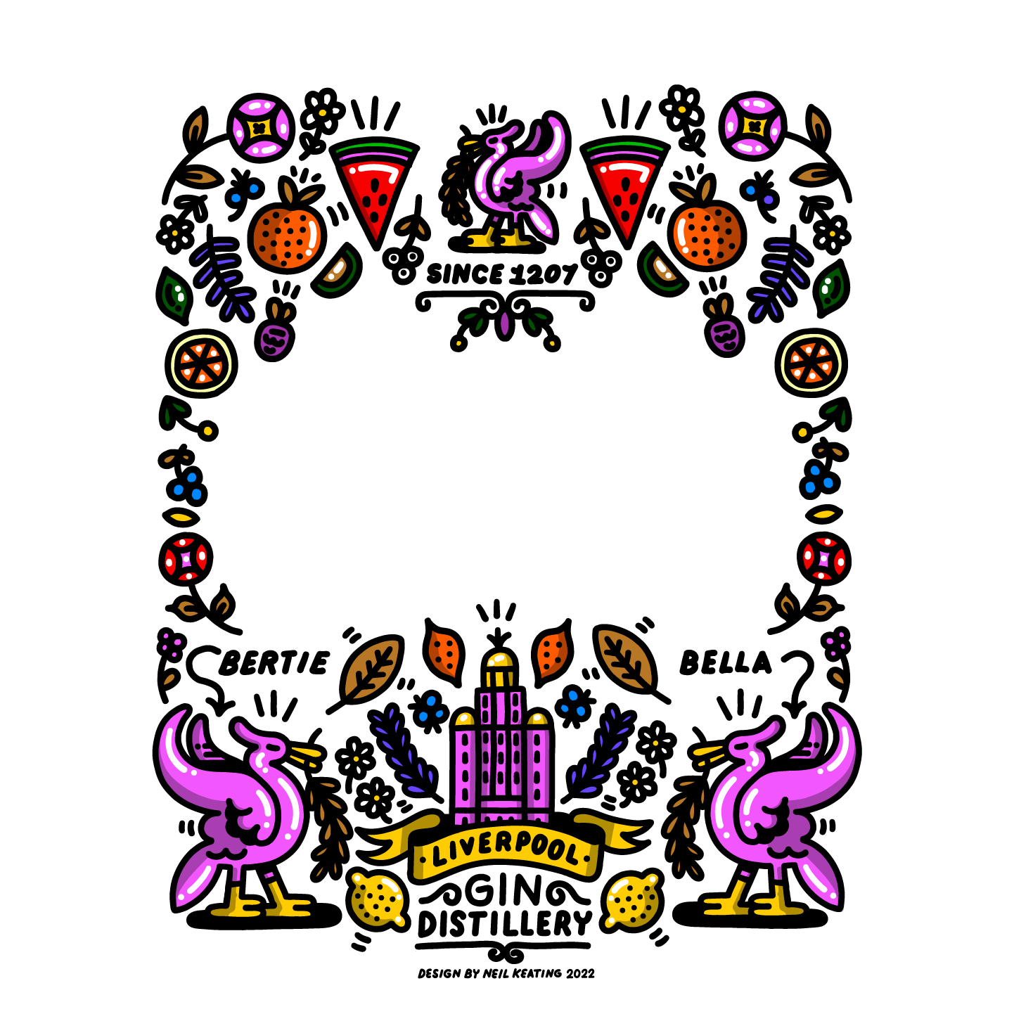
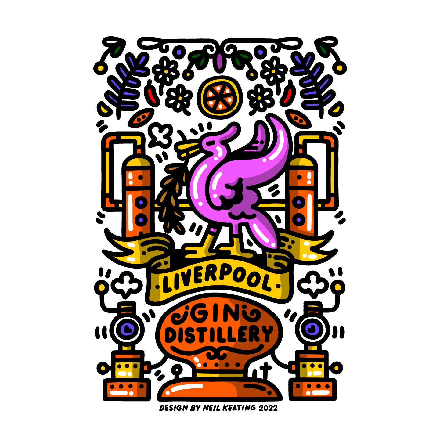
Building on this, the visual language was extended across the flavoured gin range, reimagining labels and packaging as part of a unified system.
The designs combine illustrative detail with a playful, contemporary edge balancing heritage with a more modern, shelf-ready presence. Each product retains its own identity while sitting within a consistent visual framework.
Liverpool Gin Distillery Window Design
Outcome
Distillery window graphics installed to enhance brand presence
Full rebrand of Liverpool Gin flavoured range
Cohesive visual identity across packaging and environment
Increased shelf visibility and stronger brand recognition
Impact
The project transformed Liverpool Gin’s visual identity from a single touchpoint into a connected system—linking environment, product, and brand story.
By unifying the range while maintaining individuality across flavours, the work strengthens both recognition and appeal—positioning the brand more clearly within the craft spirits market.